Chapter 15 Appendix A
Theoretical study of salaries in groups with different age / salary structures.
Suppose there is two groups A and B that both have flat age distributions.
Group B have a flat salary distribution in general, in group A the oldest
employees earns twice as much as the youngest in general.
A <- seq(30000, 60000, by=750)
B <- seq(30000, 30000, length=41)
year <- 2019
by <- (year - 25):(year - 65)
tibble(by, A, B) %>%
  gather(A, B, key = "group", value = "salary") %>%
  ggplot() +
  geom_bar(mapping = aes(x = by, y = salary, fill = group), stat = "identity", position = "dodge") +
  labs(
    title = "Salary structure of Group A and Group B"
) 
Figure 15.1: Salary structure of Group A and Group B
During the year both group A and B increase the sum of all salaries for
respective group by two percent.
tibble(A_raise = sum(A) * 0.02, B_raise = sum(B) * 0.02) %>%
  gather(A_raise, B_raise, key="group", value="raise") %>%
  ggplot() +
    geom_bar(mapping = aes(x=group, y=raise, fill = group), stat = "identity") +
    labs(
      title = "Salary raise by 2.0%"
) 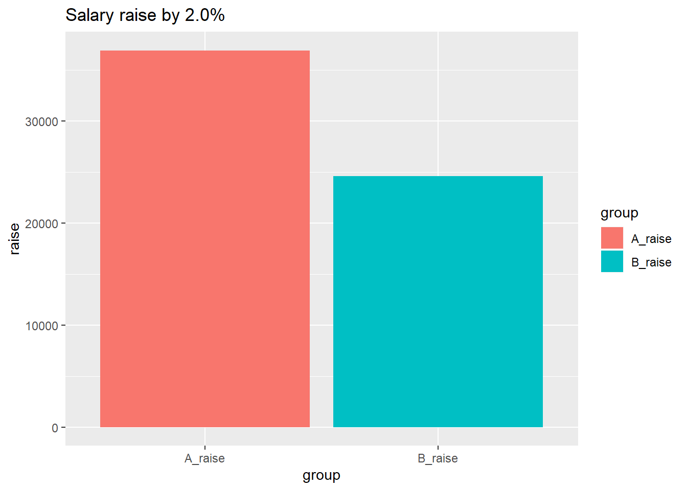
Figure 15.2: Salary raise by 2.0%
Suppose that each groups increase is divided equally to the employees within
respective group.
raise <- (A + sum(A) * 0.02 / length (A)) - A
g <- tibble(by, A, raise) %>%
  gather(A, raise, key = "group", value = "salary")
g$group <-  factor(g$group, levels = c("raise", "A"))
g %>%
  ggplot() +
  geom_bar(mapping = aes(x = by, y = salary, fill = group), stat = "identity") +
  labs(
    title = "Salary increase distribution over age Group A"
) 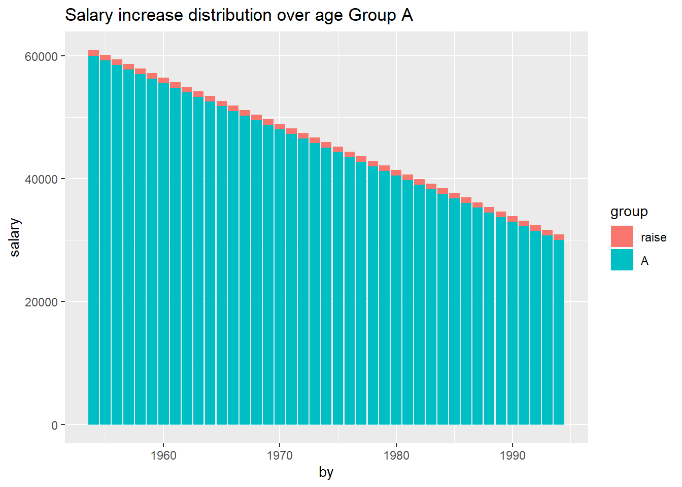
Figure 15.3: Salary increase distribution over age Group A
Suppose that each groups increase is divided equally to the employees within
respective group.
raise <- (B + sum(B) * 0.02 / length (B)) - B
g <- as_tibble(cbind(by, B, raise)) %>%
  gather(B, raise, key = "group", value = "salary")
g$group <-  factor(g$group, levels = c("raise", "B"))
g %>%
  ggplot() +
  geom_bar(mapping = aes(x = by, y = salary, fill = group), stat = "identity") +
  labs(
    title = "Salary increase distribution over age Group B"
) 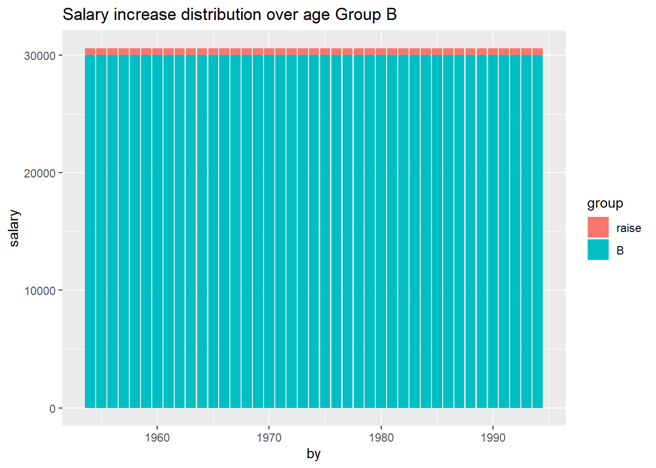
Figure 15.4: Salary increase distribution over age Group A
The oldest employees retire and new adolescents enter the job market. Suppose
that the starting salary for respective group is determined by the
age / salary structure.
by_year2 <- by + 1
B_year2 <- lag(B)
B_year2[1] <- B[1] * 1.02
raise_year2 <- lag(B + sum(B) * 0.02 / length (B) - B)
raise_year2[1] <- 0
t <- tibble(by_year2, B_year2, raise_year2) %>%
  gather(B_year2, raise_year2, key = "group", value = "salary")
t$group <- factor(t$group, levels=c("raise_year2", "B_year2"))
t %>%
  ggplot() +
  geom_bar(mapping = aes(x = by_year2, y = salary, fill = group), stat = "identity") +
  labs(
    title = "Salary distribution Group B after one year succession"
) 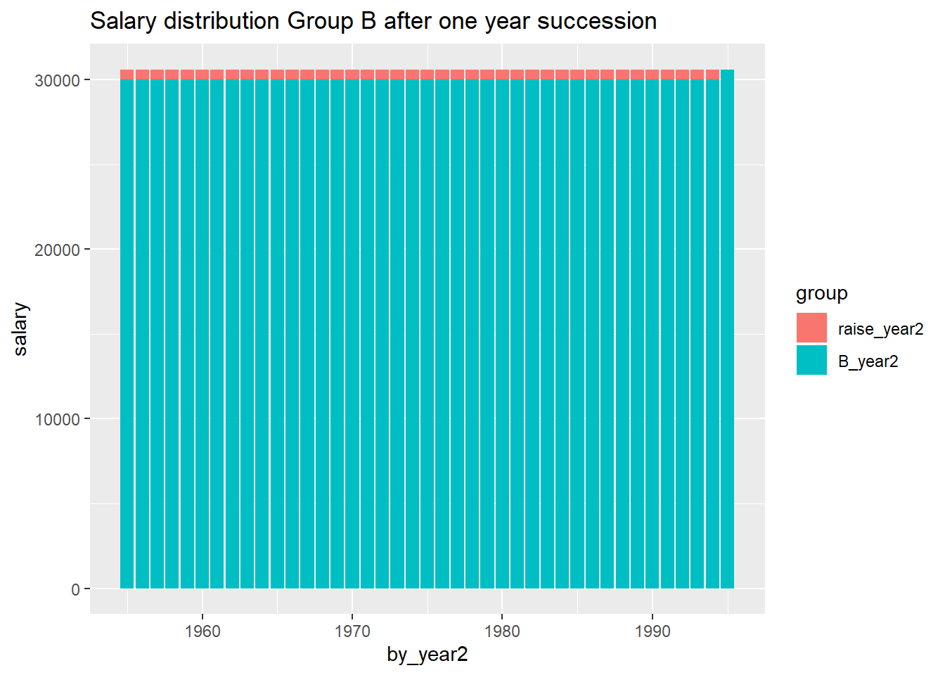
Figure 15.5: Salary distribution Group B after one year succession
The oldest employees retire and new adolescents enter the job market. Suppose
that the starting salary for respective group is determined by the
age / salary structure.
by_year2 <- by + 1
raise_year2 <- lag(A + sum(A) * 0.02 / length (A) - A)
raise_year2[1] <- 0
A_year2 <- lag(A)
A_year2[1] <- A[1] + raise_year2[2] - (A[2] - A[1])
t <- tibble(by_year2, A_year2, raise_year2) %>%
  gather(A_year2, raise_year2, key = "group", value = "salary")
t$group <- factor(t$group, levels = c("raise_year2", "A_year2"))
t %>%
  ggplot() +
  geom_bar(mapping = aes(x = by_year2, y = salary, fill = group), stat = "identity") +
  labs(
    title = "Salary distribution Group A after one year succession"
) 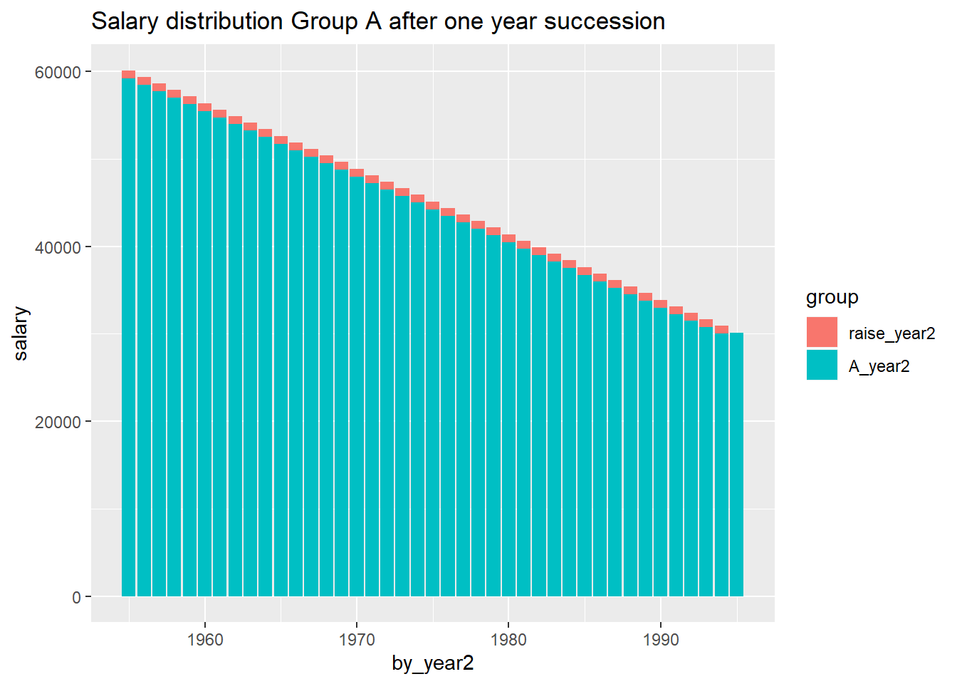
Figure 15.6: Salary distribution Group A after one year succession
Before next years salary revision the sum of the salaries have increased by
2.0 % for group B and only 0.31% for group A
tibble(A_raise_sum = sum(A) * 0.02 - A[length(A)] + A_year2[1], B_raise_sum = sum(B) * 0.02) %>%
  gather(A_raise_sum, B_raise_sum, key = "group", value = "raise") %>%
  ggplot() +
    geom_bar(mapping = aes(x=group, y=raise, fill = group), stat = "identity") +
    labs(
      title = "Salary raise since last revision"
) 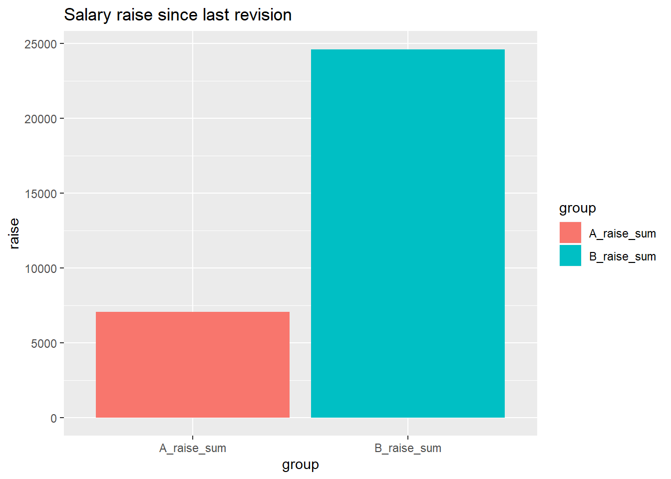
Figure 15.7: Salary raise since last revision
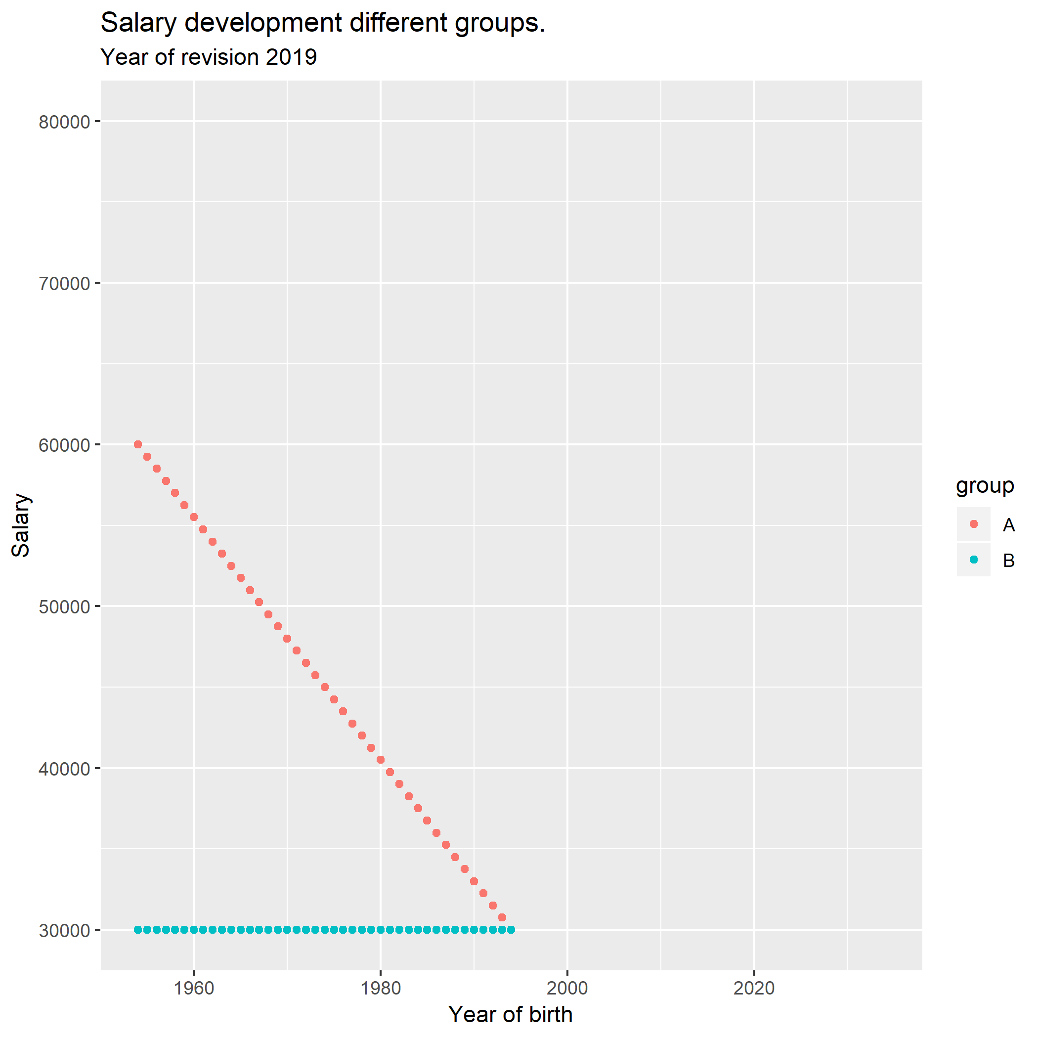
This animation shows how the salary development progresses for a longer
period of time according to the prerequicites stated above.
A <- seq(30000, 60000, by = 750)
B <- seq(30000, 30000, length = 41)
for (year in 2019:2059){
 by <- (year - 25):(year - 65)
 tibble(by, A, B) %>%
   gather(A, B, key = "group", value = "salary") %>%
   ggplot() +
     geom_point(mapping = aes(x = by, y = salary, colour = group)) +
     labs(
       title = "Salary development different groups.",
        subtitle = paste ("Year of revision", year)
     ) +
      scale_x_continuous(name = "Year of birth", limits = c(1954, 2034)) +
     scale_y_continuous(name = "Salary", limits = c(30000, 80000))
 ggsave(paste (year, sep="", ".png"))
 A <- A + sum (A) * 0.020 / length (A)
 A <- c(A[1] - 750, A[1:40])
 B <- B * 1.02
}
The animation was made with ImageMagick
“c:Files-7.0.8-Q16.exe” -delay 50 -loop 0 *.png animation.gif